Nowadays, the world is rapidly moving towards big data, due to which we need to understand large and complex data sets and extract more information from them. Big data visualization is an important tool to understand such large and abstract data.
Big Data and Visualization
Big Data is a term that is characterized by the volume, variety, and velocity of data and is particularly important in terms of data collection and processing. It involves the community collection of large and abstract sets of data coming from various sources, which may include social media data, sensor data, weblogs, and database data. The industry of Big Data turns to data science, machine learning, and analytics, and it helps in extracting new information from stored information, thereby aiding literacy and decision-making.
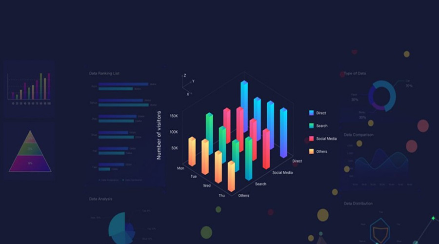
Visualization is the act of presenting data visually so that it can be easily understood. It is used to represent information using charts, graphs, maps, and other graphical techniques to reveal patterns, relationships, and trends in data clearly. Through visualization, data becomes more informative and helpful in decision-making and makes users of different levels literate, be they data analysts or individuals without technical knowledge.
Important Features
Data Literacy: One of the important features of the confluence of big data and visualization is the increasing demand for data literacy. Through data visualization, experts can present data visually, making the data easier to understand and easier to analyze. It promotes data literacy and provides informed support at personal, business, and societal levels.
Understanding and Decision-Making: Through visualization, data can be easily understood, and various patterns, trends, and relationships can be identified. It helps in understanding the story behind the data, thereby aiding decision-making. In businesses, it is used to develop new business models and strategies, improve sales and forecasting, and make other decisions.
Information Collaboration: Data visualization promotes information collaboration among users. Through this, knowledgeable people can discuss the data collaboratively and develop more structured ideas with the information collected. It helps in sharing information among team members and encourages prosperity and collaboration.
Compelling Stories: Through visualization, the storytelling of data can be done in a very effective way. It helps people understand the importance of data by presenting it vibrantly and robustly and increases credibility.
Type
Bar Charts: Bar charts present data as lined bars, which are useful for making comparisons between different characteristics. It helps in comparing data across different categories or based on time.
Line Charts: Line charts present data chronologically and show patterns of growth, decline, or change. These are used to show trends and relationships of data over time.
Pie Charts: Pie charts present data in bite-sized pieces, allowing percentages to be represented very clearly. It is useful for assessment and comparison.
Heatmaps: Heatmaps represent data as graphical shapes, showing the hotness and coldness of the data. This is useful for assessing patterns and patterns in data, typically with large data sets.
Scatter Plots: Scatter plots are used to show the relationship between two different parameters of data. In this, the data points are presented on a graphical chart, which helps in understanding the relationship.
Bubble Charts: Bubble charts represent data as bubbles, whose size and colour are used to describe three parameters. This can show the relationship between the three parameters.
Redemption charts (Treemaps): Redemption charts present data as categorized blocks, showing relationships between larger and smaller segments. It helps to clarify connections between parts of the data.
Streamline Charts: These charts visually represent the relationships of data over time and show the changes between different parameters.
Sunburst Charts: This chart is used to prove harm, such as to present the divisions between different categories and sub-categories.
Donut Charts: Donut charts are like pie charts, but they are shaped like a round cake and are used to show the representation of different parameters.
How to Use?
Collection and preparation of data: The first step is to collect and prepare the data in a suitable form. This may include data cleaning, data cleansing, and data formatting work.
Data selection: Select a particular data set for visualization. This should match the purpose of the data and your goals.
Analyzing selected data: Analyze the data in depth and identify understandable patterns, trends, and relationships in the data.
Choose a visualization: Choose the visualization appropriate for the type of data and user needs. Select bar charts, line charts, pie charts, round totals, or other charts.
Selecting graphical representation: Present data with accuracy and effectiveness using visual representation such as colour, size, and period.
Add interactivity: Add interactivity to make visualizations more user-friendly, such as visual filters, hover-information, and click-able borders for information in charts.
Literate the data: Literate its message and supporting graphics to explain the story of the data through visualization. This will help your audience understand the story behind the data.
Update and share: Update visualizations regularly so your audience always has the latest information. You can do this by communicating with the team or through a website or application.
Get Feedback: Get feedback from your users and improve the visualization based on their needs and feedback.
Advantages
Helpful in summarizing: Visualization provides a summary of data by presenting it visually, which helps in understanding the data at a glance.
Ease of understanding: Visualization makes data easier to understand. Abstracting data from features helps in identifying characteristics, patterns, and trends.
Data accuracy: Visualization increases the accuracy of data, as it helps in identifying data mistakes and duplicate data.
Visibility of data relationships: Visualization shows the relationships within the data, allowing you to understand the relationships between data and giving it greater recognition.
Help for decision making: Visualization helps in deciding between different options and helps in making the right decision, be it in business, social choices, or any other domain.
Time-Saving: Visualization helps in explaining data faster and presents the idea of data faster, thereby saving time.
Disadvantages
Misguided Interpretation: Misguided interpretation of visualizations can lead to wrong decisions, especially when changes and patterns in the data are not evident.
Storage difficulties: Visualizing big data requires overhead for which more than dedicated storage fibre may be required.
Visualization errors: Incorrect data clips, misrepresentation of graphics, or incorrect selections can lead to visualization errors, which can lead to wrong decisions.
Security issues: Tools used to visualize data may have security issues, leading to data theft or leakage.
Complexity: Visualizing big data requires complex tools and techniques, which may mean that ordinary users need help to use it properly.
Capacity and cost: Rendering large data sets for visualization requires large ability and servers, which can be costly to use.
Data Privacy: Data referenced through visualizations may have privacy issues, especially when the data is published.
FAQs
Visualization helps in understanding data, identifying trends, showing patterns, and making decisions with the data. It can be used in various fields, such as finance, health, marketing, and education.
No, visualization does not affect the security of the data, so it is important to keep the referenced data secure and maintain confidentiality.
Yes, some visualization tools can eliminate the need for coding, especially when you want to create specific graphics or charts. However, some devices use a drag-and-drop interface, eliminating the need for coding.
Conclusion
Big data visualization is an important and powerful tool to explore and understand data. It clearly shows us the unique patterns, relationships and literacy of the data, allowing us to make the right decisions and formulate appropriate strategies. Therefore, big data visualization holds special importance in today’s digital age, and it is an important step to becoming data literate.
[hurrytimer id=”15204″]